Monday, June 30, 2008

Back to Basics: Frankening

Picture this scenario: You've suddenly started to like grey polishes but you can't find a good one that's dark enough. You remember that black + white = grey, and so you decide to mix the two together to create the perfect grey.

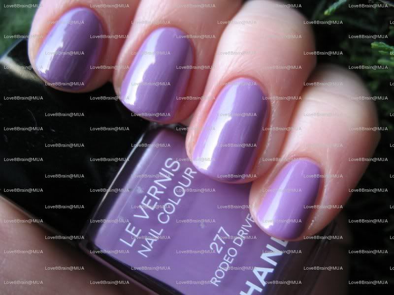
Congratulations, you just made a frankenpolish! As the name implies, it's pretty much blending polishes or pigments or glitter together to make custom colors (much like the monster Dr. Frankenstein created out of old body parts).

Making frankens is pretty fun, though sometimes they don't always turn out how you planned. Therefore, it's really best to franken only with cheaper, drugstore brands or colors that aren't too hard to find. Sometimes there can be clear recipes with frankens, other times it's a product of several polishes at all different dosages. It's always cool to play with polishes, but like with any fun activity, there are some hazards:
  1. If you're not careful, it can get messy. I always lay a tissue on my desk for safety, so you definitely want some sort of precaution. After all, getting nail polish on that $2000 antique heirloom table would be heartbreaking.
  2. Some formulas react horribly together. For many girls on the nail board, there have been...incidents where the glass in the bottles have shattered/minor explosion (not the explosion of the great balls of fire kind, more like of the crap-there's-nail-polish-everywhere! kind) when shaken. Though it's never happened to me, knock on wood, if it's a concern, mix only with the same brand.
  3. Because sometimes the bottles are open to longer periods of time, there is more secondhand fumage (not a word) from the polish. Like I'm always stressing, well-ventilated areas!
Even if you can't think of an original color to create, you can still franken when you "tweak" existing colors. For example, I had a pale pink Jordana polish with glitter that was sooo pretty...except when I put it on it was super sheer. So, I decided to make it more opaque by adding 7 drops of Orly Soul Mate. The result?

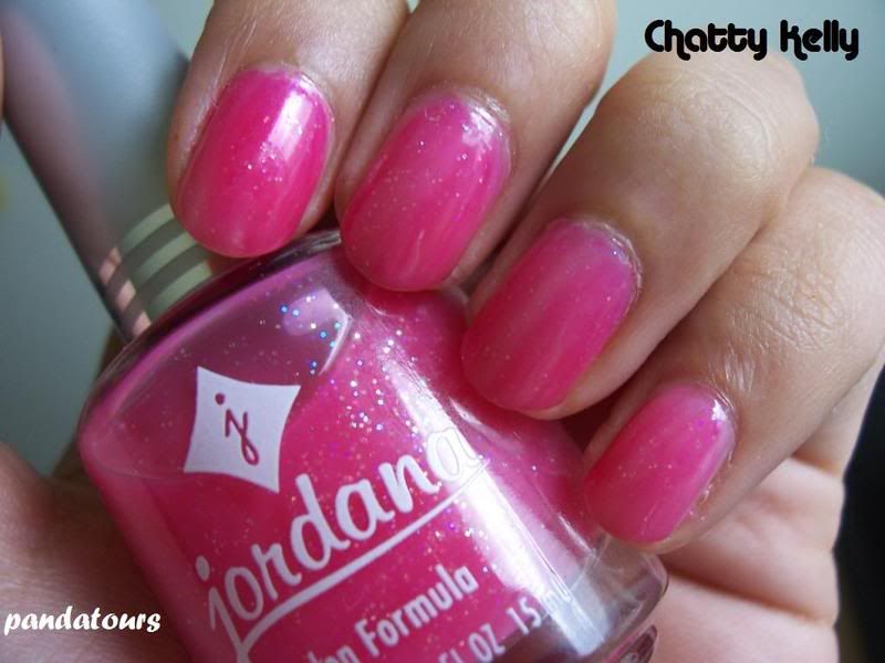
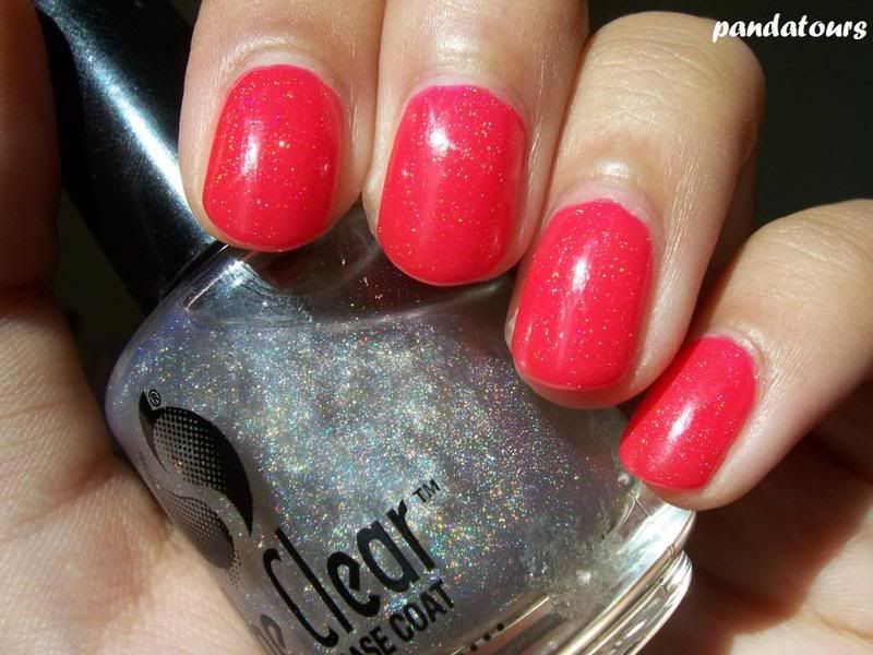
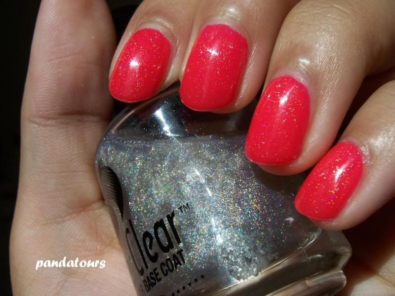
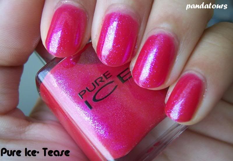
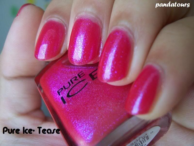
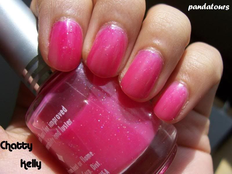
Same light glitter, but with a slightly darker base. I named it Chatty Kelly, after the fabulously chirpy, rah-rah customer service rep Kelly Kapoor on the American version of The Office. I think she would approve.

Sunday, June 29, 2008

Drugstore Gems: Black Radiance

So a couple of weeks ago, I was browsing Rite Aid for garbage bags when naturally I decided to check out the cosmetics selection. My local Rite Aid had recently remodeled their cosmetics layout, and I noticed that they expanded their line of Black Radiance cosmetics. So yeah, I'm not the target audience but that doesn't and shouldn't stop me from expanding my horizons, right? Anyway, normally their selection is only so-so but I spotted two new polishes (it helped that their stickers said New!) and at $1.99 a piece, I decided to just get them. One was a pretty burgundy shimmer and another was a vampy, dark blue shimmer.

Sadly, my color-blindness let me astray yet again. The burgundy shimmer, though named Crimson Chrome, wasn't crimson at all. It actually was VERY much a brown. Though the application and shimmer was gorgeous, it did not look good on me at all. I know some people can rock the browns but for me, it just looked like shimmery poop. Application was fantastic though:

Next up is the GORGEOUS Blue Nile. I noticed how it looked like OPI Light My Sapphire in the bottle, but sometimes that doesn't always translate the same onto the nail. However, it's pretty similar. Here is it by itself, sorry about the first picture. I prefer to take pictures in direct or indirect sunlight but sometimes the sun can wash a color out.


Want to see how similar it is to LMS? Here's a comparison, with Blue Nile on the index and middle finger and LMS on the ring and pinky finger:

I think they are pretty much dupes, except LMS is a tad more sparkly. Here's a comparison of Blue Nile, LMS, and NYC Midnight...I messed up the order of LMS and Midnight, sorry. Blue Nile is on the index finger, Midnight is on the middle finger, and LMS is on the ring finger (all 3 coats)

Excuse the blurriness too, but Midnight has more blue shimmer than the other two. Overall, Blue Nile is an effective replacement for OPI Light My Sapphire if you can't find it or don't want to pay the price of a OPI.

I had a really good experience with Black Radiance, and I look forward to trying more colors. Hopefully my Rite Aid or CVS will have more colors, I see some potentially hot ones on their website. They retail for $1.99 and are Toluene, Formaldehyde and Phthalate-free as well. They have a list of where to buy on their website, but some stores may not carry it (another Rite Aid near where I live doesn't have this line) or carry a limited selection (like my local CVS).

Thursday, June 26, 2008

A Bit of Essie

Though the New York Times has had a few blunders, they did a small, very cute blurb on Essie Weingarten (founder and head chalupa of Essie) which you can read here. I wish it had been a little longer but the article gets bonus points for using my favorite word, "cornucopia."

Since I know many people who have issues with Essie polishes and in particular, an incident with Essie's customer service last year when they reintroduced Starry Starry Night back for a limited time, I also couldn't help but chuckle when the article quoted her as saying “Every week I get complaints."

Tuesday, June 24, 2008

Impressions: Borghese Capri Coral

I've always passed by Borghese polishes in CVS and/or Rite Aid, but the $7.99 price tag always turned me off. Due to an error in tagging at a local CVS that made it on whole dollar cheaper, I decided to try it out.

Borghese polishes have a very unique brush. It's actually two small brushes put together to form a curved tip:
Despite how strange it looks, I found that applying using the brush was much better than using the OPI pro-wide brush. Well, I love the pro-wide but it can be difficult sometimes. So, the application was fairly good. The pigmentation and the coverage of the polish was also amazing, it took one coat to be opaque and in this picture it's two coats:

It also dries glossy, which is nice. However, since I was in a rush when I put this on, it didn't stay glossy when I was out for two hours. Which only proves that you always need a top coat. The color is pretty, and the bottles are very cute.

But...to be honest, I'm not sure if I would ever purchase another Borghese polish. Maybe if I really, really liked a color I would, but even then, it would be questionable. The color range is only so-so, about on par with the color range of the permanent line of L'oreal or Revlon polishes. I know my friend Eve (Love8Brain) over at MUA loves these polishes and I will agree that they are nice, but, not nice enough to justify the hefty $8 price tag. It's just too much for a polish that doesn't have a wide variety of shades such as OPI or China Glaze. I honestly think that most, if not all of their colors are easily dupes of other colors. If they are ever on sale for maybe $2 off, I would definitely get a couple but at the current price, not so much. I'm not willing to pay so much for polish that doesn't call out to me.

I should also mention though that these polishes are free of Tolulene, DBP, and Formaldehyde (aka Big Three Free), and that these polishes are also not tested on animals. It also has a lot of added botanicals and natural ingredients such as aloe, sunflower, chamomile, sweet almond, grape seed, and olives. I'm not sure that the added botanicals really do much (they do sound impressive though), but I know for some people, the whole Big 3 Free and animal testing status is very important.

So speaking of doing good for the environment and for the earth, I haven't given an eco tip in a while! With the weather getting hotter and hotter, hydration is power. Now, plastic water bottles are just terrible for the environment but unfortunately, they are very handy. In fact, I'm guilty of consumerism right now because I just bought an Aquafina from the student store. But, I'm totally going to invest in a stainless steel water bottle as soon as possible. Not only will it help in keeping my water cooler and fresher, it's a great alternative to plastic bottles (even the Nalgene ones). Other than buying online them online, you can find them at REI or EMS...any outdoors store I think. I'm just getting impatient so I want one now! Temperatures here recently have been in the 100 degree Fahrenheit range.

Monday, June 23, 2008

Calm

Sorry for the trickling of posts guys. Though I'm young, I still remember the days before the internet and modern cable with its 9 million channels. In fact, I remember as a child I used to spend time outside. Sometimes at a park. Always doing something. Ah, the days of fresher air. But these past few days I've been without internet or tv, and it's made me realize how dependent I am on technology. Not always a good thing, but it's kind of hard to be a blogger without the interweb. Anyway, for the time being I'm just going to be spending a lot of time here at school mooching off the free internet we get.

Anyway, during one of my many days without the internet, I couldn't decide on a color to paint my nails. Being desperate, I ended up just texting one of my friends and asking him to pick any color. He picked blue. At first I put on a dark blue, but it wasn't meant to be- it bubbled and I just didn't like it. I found perfection with the second blue- Jordana Sapphire. It literally reminds me of how ocean water is supposed to look like. It's a gorgeous light, jewel-tone blue with just enough sparkle. I love it.

Jordana polishes are kind of hard to find, I found mine at a random non-chain 98 cent store. Sometimes you never know what you'll find in those stores, it's always worth looking in my opinion. Jordana and Kleancolor are both brands of polishes that are underappreciated and undermarketed that you can find in those random dollar stores.

I think this polish, along with some of my other blue polishes, will be enough to tide me over until China Glaze launches their Bahama Blues collection. Of course, by then I will be studying in China. I have no idea what polishes I'm going to bring! I'll probably bring OPI Shanghai Shimmer and then maybe OPI 20 Candles on My Cake since I'll be turning 20 when I'm studying abroad! And then I'll just buy the rest of my polishes there. I'm excited, two months to go! It sounds like a long time but time flies during the summer.

Saturday, June 21, 2008

Responses

Yesterday I went to L.A. with some friends and I had a blast! We hit Japantown for some ramen and then spent two hours at the Griffith Observatory, which is quite amazing. Finally, we ended up at Huntington Beach for about forty minutes. It felt so nice to just get away. Unfortunately, even though we had a blast, I ended up coming back around 2-3am! Add on another hour and a half of erm, talking to a certain person on the phone, and well I was exhausted.

Pretty much, I'm being lazy and fully utilizing the meaning of summer. However, I've begun to neglect my duties as a blogger a bit. Like I've said before, I like to post everyday. Or at the very least, every two days. Maybe you guys, as the readers, can't tell but I definitely can! I like to respond to e-mails and comments as soon as possible.

In response to my last post, reader Shryh brought up an excellent point, saying "I actually think it's high time we started pushing nail polish boundaries at the workplace. I understand if you're in a conservative field like finance or law neon pinks and yellows might be a bit incongruous. Navy blue, vamps and greys, on the other hand, strike an appropriately somber note." First off, I love how well-worded and logical this comment was. I've also totally added 'incongruous' to my vocabulary because it's a cool word. But really, she does make a good point. Since I'm still a student, I don't really know how the workplace works. I offered my opinion before that I believed that in professional environments, people should stick to neutrals colors. However, Shryh really did bring up a good point that darker polishes could convey a different sort of professionalism as well. I guess it really does depend on each individual work environment.

Another reader, Sania, asked (in response to the SH Nail Brightener), "
Since you mentioned that this base coat destroyed your nails, I'd *love* to know what you do to get them back into good shape. I had a np absolutely destroy my nails last week, and like yours, now my cuticles are dry and peely, and nails stained. Any tips?" In order to restore moisture to my nails, I use a combination of hand lotion and a cuticle balm for intensive, direct moisture. I really like Eucerin products personally, and for a cuticle balm I really like Burt Bee's Cuticle Balm. You can find all these things at local drug stores or at Target. Since the water in the city where I attend college can be very drying, I also use gloves whenever I wash the dishes. For peeling nails, it's always a good idea to invest in a strengthening base coat too. Also, though I normally do wear nail polish, if I do have dry nails I generally try to restore moisture a bit before I put polish on again.

I know I talked about Camp Rock before, and since it premiered today I guess I should share my thoughts on that. Well, I didn't really care for it. However, I did put on polish during it so it wasn't a complete waste of time.

Speaking of being unimpressed, All Lacquered Up has a sneak peek of the Chanel Fall Collection polishes, and none of the colors really stand out to me. I'm not a huge fan of gold polishes but even so, the $30 price tag for Gold Fiction is enough to deter me from buying it. After all, with $30 you could buy like 3 or 4 other gold polishes. Kaleidoscope definitely would not look good with my coloring and Fantastic is spectacularly not fantastic. If I'm going to pay $19 for a polish, it's really got to call out to be and these Chanel colors aren't doing it. I'm really disappointed by Kaleidoscope too, I really hoped for it, which was described as a green-gold, to be greener. So much potential. So much fail. Oh well, more money for the OPI and China Glaze collections!

Friday, June 20, 2008

YSL Fall Collection '08 polishes

I think anyone can rock any color they want all year round, but generally more people wear vampy, or darker, colors during the fall and winter and brighter colors during spring and summer. It has a lot to do with the sunshine, I think.

The pictures from YSL's fall collection, courtesy of A Touch of Blusher, has caught my eye with their two dark colors...it's hard to tell exactly what colors they are but I'm loving the darkness of it all

Hopefully these colors will be interesting and not flat and boring and like any other vampy color. Otherwise, they wouldn't be worth the money at all.

Source: A Touch of Blusher

Wednesday, June 18, 2008

Early Morning Hotness: Chinese Colorama #32

I've gotten lots of great responses to my post Wow!...hopefully I'll get more input from my international readers!

Sara from Sweden, who runs her own polish blog too!, says "Most people here don't wear any np at all, but those who do are mostly sporting bright colors right now. I hope my blog will inspire more people to wear np! :)" Oh goodness, I hope that more people do, have you SEEN the colors that she has? Gorgeous!

An Anonymous commenter from London, England says "I work in financial services and like me, most of my friends are professionals in fairly strict working environments. So I mostly see french or sometimes reds/pinks. Boring, and not really a trend per se...but since getting on the NB, I have been trying to push the boundaries recently with blues and oranges to work!" I hope our Ms. Anon becomes a trendsetter for her fellow Londoners! While it's true that in a professional environments one should usually stick to safer colors (Essie-esque is how I like to think of it), how are you supposed to know the boundaries without testing first, right? For those who paint their toes can do some fun colors so even though your toes aren't showing, at least you'll know what fun colors you're secretly sporting!
Finally, Elizabeth from Australia says, "Unfortunately live in a pretty style-free zone (Hobart, Tasmania in Australia). Most people who do their nails get those ugly thick and squared off fakes, which just look so tacky (what we call “bogan” here!). a couple of my friends order polish from online, as OPI is either non-existent or very, very expensive (twenty Australian dollars)." First of all, I love slang from other countries, it's so cool to learn the vernacular of other cultures. And I'm really glad that Elizabeth actually does her own thing, trends be damned. Keep rocking those unconventional colors, you're way ahead on nail fashion!

I do know that OPI is very expensive in other countries or hard to find. Last winter my sister brought back some lovely Colorama's for me from China! One of them, #32, is a perfect gorgeous inky blue.


I might have to stock up on this beauty! The bottle is tiny, but as far as polishes in Asia go, it's pretty cheap (except for street polishes but I don't trust those)...19 RMB (a bit less than $3 US).

If you haven't already, check out the new China Glaze collections on Scrangie's blog! I'm really feeling the Bahama Blues, but the Operation Color chick looks sooo much like Angelina Jolie I can't get over it. Except with blonde hair. I must confess though that I'm looking forward more to China Glaze's collections over OPI & Chanel's...and don't get me started about what I heard and seen about Creative Nail Design's Fall line, ugh. Disappointing for the company that brought us the original neons in form of Hot Pop colors, in my opinion.

Impressions: Sally Hansen Insta-Brite Nail Whitener


Hmm. Well, I've used this base coat for about a month now, and my nails are very, VERY dry. Like completely stripped of oils. I left them naked and bare for two days and it was still very very dry and my nails were peeling more so than usual.

The directions are: Apply one coat over clean dry bare nails; let dry. To maximize effects, apply a second coat. Perfect under nail color or wear alone for natural nails with a healthy radiance.

It's supposed to:
  • Brighten and Smooth Natural Nails.
  • UV Protection to Resist Yellowing; Enriched with Natural Extracts.
  • Instantly whiten and brighten nails for a fresher cleaner appearance.
  • Helps correct the visible effects of staining and other discolorations of the nail and intensify the white of natural nails.
  • Ridge-filling action creates a smooth flawless finish.
As a ridge-filler, it's pretty good. I've also tried this by itself, just using two coats. It did make my stains look lighter in some lights because it has very fine, sparse micro shimmer...but in other lights it just made my stains more obvious.

As a basecoat itself, it actually did prevent staining which is something even the almighty Barielle Camouflage can't do. Also, my stains did fade a bit. However, given how the negatives outweigh the positives, I can't say I'll ever buy this one again. It does make a decent top coat though, because of the micro shimmers.

SH Insta-Brite Nail Whitener retails for $4.99 and can be found at Target

Tuesday, June 17, 2008

The Chanel Storm

Author's note: I started writing this when the Robertson Blvd. LE polishes appeared, it's a bit out of context now but is still pretty applicable I think.

Every time Chanel launches a collection, it seems as if the nail board erupts with lemming-fever. But it's also around this time that this question gets tossed around a lot: "What makes Chanel polish better?"

It's always been my opinion that polish is polish. I'm not a brand snob by any means, I buy both dirt cheap, fun polish like NYC and WnW but I also spring for retail prices on OPI, China Glaze, and Orly (of course, if I find them on sale it's even better) for instant fixes. My first Chanel polish purchase was Azur (my sister bought Blue Satin for me because she's wonderfully patient with my polish addiction) and I don't regret it. I think if I found a counter near me that still sold Sirene and Orange Blossom, I would spring for those too. Why? It's not that Chanel polish is any other polish, but because of those specific colors. The annoying thing about nail polish is that yes, sometimes there are dupes. But sometimes there aren't exact ones that can take the place of the original polish.

Nope, Chanel's not better. It's not chip-proof and has issues like any other polish. But why bother with them? Some of the colors, for one thing, are just amazing. Also, let's face it: everyone likes a bit of luxury sometimes. I mean, that's the notion that the cosmetics industry capitalizes on, it's the reason why, in my opinion, the fashion industry thrives. The label Chanel is practically synonymous with luxury, along with Prada, Louis Vuitton, Fendi, and Dior. But, there is one thing that sets Chanel apart from the others in the polish world: the other brands either don't make nail polish at all or they don't have an expansive color line like Chanel. Sure, Dior's recent Gold Nugget and Poison Blue sparked mini-frenzies but that's about it.

Everyone likes to be spoiled sometimes, and everyone has their own little obsession. Mine just happens to be nail polish. As a rule of thumb, most people in the world are brand-whores. We don't buy generic because we trust the brands we grew up with and are advertised daily (though sometimes generic isn't always good...yes Target Generic Eye Makeup Remover, I'm singling you out!). So yeah, I've got freaking Chanel polish. It's awesome. Worth the money? Probably not. But it's CHANEL. The luxury brand name says it all.

Doesn't mean I'm going to spend $30 on a polish though. For that much money on a color I don't really care for I expect the polish to wash the dishes and do my laundry. I like a bit of luxury but I still draw the line somewhere.

Early Morning Hotness: Essie Neons

I apologize for the delay in getting these pictures to you guys, it's been a very hectic week. I rarely get chips in my polish but I actually did get two while moving on Saturday. I felt like I had crossed an important milestone in my life, hehe. I haven't even caught up with my daily readings of the nail board at MUA and CNN/BBC in the past four days. It's been quite a week.

Anyway, onto the neons! I normally swatch without a base or top coat but since neons dry so matte due to the pigmentation in them, I added a topcoat to truly represent the color. Here they are all together:
L-R: Bermuda Shorts, Shorty Pants, Mini Shorts, Short Shorts

First, although I'm not a purple girl I must say that I really liked Bermuda Shorts. It had one of the best applications of the four, and it made my skin look very pale (always a plus in my look, I hate that I tan so easily). It's a great vibrant neon purple.
Now, I love yellow polish, but it does make my fingers look extremely tan. The contrast is nice but it doesn't photograph well. Anyway, Shorty Pants is a gorgeous neon yellow creme that is a true yellow, it doesn't turn out mustard-y like Icing Smooth Like Butta does. However, I must say that the application on this one wasn't the best. Maybe it was finicky because it wanted to have a name ending in 'shorts' too? It might be a yellow thing (NYX Carnation was also very streaky, NYC Taxi Cab Yellow was too watery/streaky until I let it dry out), but this one does require a lot of patience.

Ahhh it makes my hand look so dark! But honestly the contrast is awesome. I gave a sneak peek of Mini Shorts earlier, but with topcoat it definitely gives it that extra kick of neon. This one also had a good application

And finally, Short Shorts. I didn't think it was very neon until I looked at it on my computer screen (disadvantages of having a crappy digital camera and being colorblind). Just....wow. Definitely a pink that makes a statement. The application on this was ok, not perfect but workable like most other polishes.

Neons are hard to photograph but hopefully I did ok. I had to slap Orly Live Wire over Shorty Pants though to make it even more gorgeous (I love shimmer)...hopefully everyone can see the glorious golden shimmer...if not, click to enlarge.


And yes, I've graduated from tagging my pics with my MUA name to the blog URL. Does it look ok?

My nails are actually bare now, one because it's easier to swatch on whim whenever I please but also because my nails are recovering from using a SH basecoat (more on that later) which completely dried out my nails and stripped them completely of their natural oils and made them peel a bit. Ugh. More on that later, I'll have a complete product review. I've also been really good on not spending too much on polish lately but I did haul quite a bit today. I got my first Nubar polish (Cotton Candy), my second Zoya polish (Akyra), my first SH Salon line polish (You-Gurt Style) and my first Borghese polish (Capri Coral). But those are not the only polishes I got, which is quite terrible!

Anyway, even though I had some application issues, these neons are still really hot and perfect for summer!

Monday, June 16, 2008

OPI Overload

OPI is going all-out this fall! They're launching a fall collection, a Halloween collection and a holiday collection! Geez, do these people ever sleep?

I gotta thank kschmiddy over at MUA for compiling these pictures together in a convenient post! My laptop has been really weird with Adobe Acrobat lately, I don't know why.

First, the fall collection, which will supposedly start appearing in August: La Collection de France. I hope OPI isn't running out of countries! At any rate, the names of these are as punny as ever, even though the colors only look so-so.


As always, click on the pictures to enlarge. Here are the names: Parlez-Vous OPI?, Louvre Me Louvre Me Not, Eiffel for This Color, You Don't Know Jacques!, Tickle My France-y, Baguette Me Not, A Oui Bit of Red, Crepes Suzi-ette, Bastille My Heart, Yes...I Can-Can!, We'll Always Have Paris, I'm Fondue of You

Adorable.

Here's the Halloween collection...personally I liked last year's better because Booberry was very cool, but it's just like every other Halloween collection they've done: black, orange, glow-in-the-dark, and decals. Still cool though!

And finally, their holiday collection

What do you guys think? I'm personally excited for the holiday collection more than the France one, but the France one might be amazing.

Friday, June 13, 2008

I'm (Somewhat) Free!!!

As of 1pm today, I finished my last final! Whew, it feels good to get that out of the way. Though overall the past 24 hours have not been good, I like to focus on the positive. Never mind the fact that I barely got three hours of sleep and pretty much look like the Crypt Keeper, and that my room is a mess and I need to get my ass in gear so I can start moving tonight, it finally feels like summer!!!!!!!!!!

Summer always reminds me of sunshine. And today, despite my mood, there was plenty of it. So here's a great color that sums up my mood

I love how bright and fun this color is, though I wish the golden shimmer you see in the bottle would translate better onto the nail (like OPI's Cara Mi Crimson) but it's still a nice cheerful polish. Zoya polishes can be hard to find, but they can all be ordered through their website as well.

Zoya polishes are usually named after someone or something. I Googled Tosca to see what comes up and it's the name of an opera by Giacomo Puccini, the same composer as La Boheme and Madama Butterfly. He also composed the amazing "Nessum Dorma" and "O Mio Babbino Camo." Ironically, I was just listening to those songs on my itunes through a great band called The East Village Opera Company. I listen to all kinds of music, and EVOC is amazing, giving a modern twist on classical tunes and opera tracks. My favorite still has to be their version of The Marriage of Figaro by Mozart (it starts at the 1.50 mark).

Despite my excitement for fun summery colors, I think my next nail color will be blue to celebrate the birth of a dear MUAer's son! Congrats to tobywoo and her new son, everyone is so excited for her =)

Thursday, June 12, 2008

I've been tagged! + some more Passion Fruit

I'm excited that I got tagged by Tink over at Casual Lavish! For a relatively new blogger, it's always nice to have other blogs that link to yours.

The Rules:
*Post rules at the beginning of the post.
* Answer all the questions.
* Tag 6 people, and go to their blog and leave a comment to inform them that they’ve been tagged and asking them to read your blog.
* Let the person who tagged you know when you’ve posted your answer.

What were you doing ten years ago?
Ok honestly, I have a terrible memory. As one of my friends often says, it's mind-boggling how I either remember or forget sometimes....oftentimes instantaneously! Seriously, it's terrible. Ummmmm ten years ago, I would have been 9. So I was finishing 4th grade! Wow. Actually, 4th grade I remember. I loved it because I was in a 4th/5th grade class and I was doing 5th grade math. My parents were happy because I was, in true stereotypical Asian form, excelling in math (later they would realize that while I am wonderful at basic arithmetic, I am not a science/math person). I think I was given the opportunity to skip 5th grade, but I don't remember if that was the case at all. Anyway, I had a fun childhood. I think this was the age I started reading the His Dark Materials series and a family friend introduced me to Harry Potter. I was soooo one of those who were ahead of the Harry Potter fandom, I swear!

What are five things on your to-do list today?
Seeing as the day is almost over, I've already done some of these...
- go to a review session for a final tomorrow
- get gas & buy containers for moving
- study for my final tomorrow
- start packing
- get a good night's sleep!

Places you've lived?
I'm California born and bred...I have roots in NorCal but currently attend school in SoCal.

What are 5 things you would do if you were a billionaire?
- put some of it in the bank/use some of it to invest. I'm a billionaire now but I'd like to keep it that way too!
- buy my parents & sister a house in Monterey, CA. House? Oh I mean, a mansion. It would be big enough so that my parents would never see (and therefore never nag) my sister. Or just buy them separate houses, I don't know.
- give a good portion away to charities and my churches
- travel the world
- start a charity

People you want to know more about?
All my friends, whether they be high school friends from back home, college friends I have here now, or friends that I've made online =). Also, ideally some nice, cute boys too.

OK, here's the sad part. I don't have enough blogs to tag because I'm sure some of the ones I can think of have already been tagged (like 15Min. Beauty). So, I'm just going to tag Scrangie (Queen of Swatches is usually how I refer to her), the O.G. polish blogger Michelle from ALU and the ever-so-sweet Vanessa Garcia of Nessasary Makeup for now.

~*~*~*~*~*~*~*~*~*~*~*~*~*~*~*~*~*~*~*~*~*~*~*~*~*~*~*~*~*~*

Alright, so I've already changed my polish but before I did, I slapped a holographic topcoat over Orly Passion Fruit. It was seriously beautiful. I used Bratt_the_Catt's recipe for a homemade holo topcoat for this one. For all you non-MUA readers who don't want to sign up to read the post, here's the gist of the recipe:

Any clear polish (I used Seche Base, but any topcoat is ideal)
OPI DS Shimmer
ballz!

Paint your nails with a creme color (either red or pink would be good). Start adding DS Shimmer to the clear polish. I'm impatient so I just dumped a bit in, shook it hard and then started adding drop by drop. It's a bit of a process because you don't want to add TOO much DS Shimmer because then it will alter the color of the original polish. That's why swatching the franken topcoat over the creme color on your nails is a good idea.

Here is is:


Excuse the tipwear, that's a 5-day nail color there! As for the holo, it's much more noticeable in real life, the sunlight sort of washed it out. I adore it, which is why I'm currently wearing Ruby Kisses Neon Green with the frankenholo topcoat over it! Pics coming soon, I promise. I have one more final left!

Monday, June 9, 2008

Eagle Eyes

Early readers of my blog may know of one of my guilty pleasures is Gossip Girl, but I'll reveal two more: The Hills and Disney Channel. Why? Good question, sometimes I don't even know.

I like that they're mindless entertainment so you can let your brain take a break. Also, the bad acting done on The Hills just contributes to the "reality" of it all. And I love making fun of what my sister and I impersonate as "THE GASP." Because every episode has dramaaaa, and every episode sometimes does "THE GASP." Most of the time it's just either one of the females just opening their mouth....in faux shock. Yeah, super dramatic. However, I did spot Lauren using a top coat during one of the episodes.

The nail board and I had a super hard time figuring out what exact top coat it is (while geeking out over the various designs and textures of bottles), all Lauren ever says is that it dries super fast. Not helpful since most all top coats make that claim. However, it's either the Sally Hanson Salon line top coat or the Lippman Collection top coat based on the screencap here. The Lippmann would be more likely since this girl has no qualms about spending the cash, but the SH Salon line might also be plausible because Lauren apparently loves SH Pat on the Black, which is usually the black polish she sports on the show.

I don't know why I watch the Disney Channel anymore. I just do. It's who I am. I loved the first High School Musical....the second one was ok (my roommate does a hilarious impression of Zac Efron when he's singing Bet On It though). While food coma-ing on the couch yesterday after delicious Mexican food, I caught the trailer for the newest Disney Channel Original Movie (DCOM), Camp Rock. The following exchange happened between two girls:

Girl 1:*holds up two nail polishes* Which color?
Girl 2: They're exactly the same
Girl 1: So you see my dilemma!

What also caught my eye were the polishes Girl 1 was holding up- definitely L'Oreal Pro polishes
You can watch the trailer here to see the exchange. It's pretty funny, yet at the same time surreal...it's hard picking between dupes! Sometimes there are just subtle differences that make you want to justify keeping both. I also wonder if L'Oreal paid for that product advertising or if it was written into the script and they just picked a random polish brand. Most likely the former though, Camp Rock is billed as the next High School Musical and this definitely boosts L'Oreal's stock.

Sunday, June 8, 2008

Not For the Color Shy....

Is there a certain polish that brings you good memories? The one I can think of most prominently is Orly Passion Fruit. It's the color I was wearing to support one of my favorite tennis players, Novak Djokovic, during the finals of the 2008 Australian Open (I didn't have any of the Australian OPIs, so I just went for the word 'passion,' hehe). Ok so yeah, Nole's a little arrogant and sort of bends the rules sometimes when it comes to his excessive ball bouncing and whatnot. But that boy definitely has potential. And at least comes off as very charming in interviews. Hey, at least he gets put in his place too by Nadal and Federer. No matter how much he tries, I don't think he's going to advance much further than where he's been at for almost a year. Not yet, at least. Federer's poor performance at the French Open might foreshadow the end of his reign. But all three of them are amazing players!

Sorry, tennis tangent. Anyway, Passion Fruit. It's what I was wearing when Djokovic won his first (and hopefully not last!) Grand Slam title. Kind of a big deal, yes, but let's hope that he doesn't take the route of Andy Roddick (never really been a Roddick fan, sorry) and stays consistent. Well I figured this week I could use some luck, because clearly my polish helped Djokovic win....it's like he knew my passion for him. Ok, toning down the crazy, I promise...though that was also half-sarcasm there too. Half. I still love him. Seriously though, Passion Fruit is NOT for the color-shy. It's noticeable and is one of those statement polishes. It's a very bright, hot pink. Surprisingly I was able to capture the color pretty well.....


Also, as a favor for hill78 on MUA, I swatched Essie Mini Shorts yesterday when my nails were bare (I was getting ready to paint Passion Fruit but one swatch doesn't hurt!)....as with all neons it does dry matte. I tried to take the pictures as soon as I could but they still dulled a bit. The color is definitely brighter in real life. I've never been much of an orange girl but this could be a cool color to rock during the summer.


Also, I would like to thank the many of you who responded to my post Wow!, I've received a lot of great info about nail trends and colors in other countries! When I have a few more I'll be sure to post their thoughts. Thank you all!

Friday, June 6, 2008

What a Tease!

After a long and exhausting week, I'm ready to relax.....by studying for finals next week. I've given into the fact that the first half of June has/is going to be a lose-lose situation. But look what beauties decided to drop in today:
L-R: Bermuda Shorts, Shorty Pants, Mini Shorts, Short Shorts
Yep, the new Essie Neon collection. They released a LE neon collection last year too, but those were much sheerer. From the pics I've seen on MUA and 15 Min. Beauty Fanatic, these are highly pigmented. I'm eager to try these, but I will have to wait...but instead of just being a tease, I present you with pics of another polish.....Pure Ice Tease. It's a perfect summery color, a bright fuchsia with a hefty dose of blurple shimmer. I'm not sure how to classify the shimmer in this but it's so nice!


Pure Ice polishes can be found at Walmart for fairly cheap, I've forgotten the exact price. But they are good quality polishes for the money. Everyone over at the nail board has gone crazy over Pure Ice Heartbreaker, which is a great polish for layering over cremes because of the gorgeous shimmer in it. Also, occasionally these polishes will be out of stock...don't resort to the internet! Eventually they will be restocked, sometimes in a matter of days. Patience, patience.

With Essie's new neon collection as a direct competition with MAC and Chanel's neon collections, what do you guys think? It's definitely the cheapest alternative compared to the rest, but they are all different enough to justify (in my world at least), having them all. MAC's Phosphor, for instance, is a bit more frosty than Chanel's LA Sunrise or Essie's Shorty Pants. LA Sunrise is also lighter, and Shorty Pants is the only out of the three to be a straight creme.

Also, given Essie's surprising hit with their summer collection, and now a collection of neons, do you sense that they're branching out from their usual conservatism? Granted, the neon collection is limited edition but the pigmentation is a departure from the demure Essie polishes of the past. This could be the evolution of something great....perhaps a collection of sheer holo's? Something that incorporates their signature soft, workplace-safe colors with an infusion of holographic glitter for a bit of edge. I could easily see a nice nude holographic version of Congo Bongo, a pretty soft pink holo version of Charmeuse or My Place or Yours, or a pretty white holo with Intimate. China Glaze and OPI have all released holo collections, what do you guys think? I'm always in favor of progression while not completing leaving behind the basics. I think it's possible that Essie's color selection could become more daring without alienating their original fan base. After all, their tag line is that Essie is a color-holic. It's nice to see that becoming more of a reality now.

Thursday, June 5, 2008

Spicing Up the UK Glamour Awards

I love the Spice Girls. To me, they defined my childhood. Baby Spice was always my favorite though I also adored Ginger Spice. I have a thing for redheads, I think. I just think being a redhead is so pretty and unique. Anyway, the other day Emma Bunton, Melanie Brown, and Geri Halliwell came out to receive the award for "Best Band" at the UK Glamour awards. They all looked fabulous, I especially love Geri's hair. Sorry, the picture may be a bit small.

L-R: Melanie Brown (Scary Spice), Emma Bunton (Baby Spice), Geri Halliwell (Ginger Spice)

Mel B and Geri are sporting very light tips. Geri's are more neutral while Mel B's are definitely on the lighter side. However, given their wackier (in a good way) and more colorful dresses, keeping your tips neutral might be the best option as to not detract from the dress. I do think that Mel B could have sported a vampy, sexy black/dark purple to complement her dress as well but I do love the contrast of the lighter nail color against her skin. Emma on the other hand went for the red/black contrast, a classic.

Emma's nails remind me of an tip in the latest issue of InStyle, in which they say how stylish short red nails can be. For once, I'm actually agreeing with a fashion magazine on a nail-related tip! Yeah my slight fever might be back again huh? But really, I think short bright-red nails are youthful and fun, definitely great for the summer.

Picture source: Popsugar UK

Wednesday, June 4, 2008

Wow!


When I'm procrastinating, I do a lot of stuff for this blog. The most tedious part of running a blog is compressing and marking the pictures. The hardest part is keeping things interesting with a diverse range of subjects.

So whilst tracking the number of visits to my blog, I stumbled across the fact that I get a fair number of hits from outside of the US! It shouldn't be surprising, given the fact that the internet is so worldwide and has made communication so easy but I'm really floored and honored that people from other countries are actually interested in what I have to say. Though I also get my fair share of spamming on my comments (apparently I've won the UK Lotto like 8 times!)

Since I love diversity and love learning about other cultures, I have a simple request for some international readers. If you don't mind, please e-mail me about some nail trends you've noticed in your country! I'd love to know how nail polish and nail color are perceived in other cultures....I know nail polish has only in like the past 5 years really boomed in China, even though it's been around for a while. So if you guys don't mind, let me know by e-mailing me at ballzandthinner@gmail.com . Thanks!

Also, I've forgotten until now to link up MUAer paprheart's beauty blog, P'ssion. It's in Swedish, but she has great nail pics and you can tell generally what she thinks of beauty products through her reviews. You can also run it through Google translate (there's a button on the page) for a translation as well. The translation isn't perfect, obviously, but it's pretty good!

Tuesday, June 3, 2008

Early Morning Hotness: Chanel LE Robertson Blvd. collection

Get ready you guys, this one's a doozy. From the pics of Chanel's Robertson Blvd. collection, it's obvious that everyone's hopes that it would be exactly dupish to Essie's Neon Shorts collection were wrong. These colors are all gorgeous, not TOO neon but not too blah either. After seeing these pics, I really wish Chanel would add them to the permanent collection. And also because that would mean that we wouldn't have to pay $6 more for these stinking beauties.

Special thanks to the amazing Eve from MUA's nailboard for these pics! Please do not steal these pics (which is why I've watermarked them to death), she worked very hard on taking these. If you want to use these pics, please either link back to this blog or PM Love8Brain over at MUA for permission. I know there are Ebay scalpers out there already hawking these polishes for crazy high prices. I have to stress that unless you are from outside the US, usually buying these types of polishes off Ebay are a rip-off. However, especially for the girls in the UK, sometimes you can find really great deals on these things when you factor in the currency exchange. Just use some common sense before falling over backwards to bid! And as always, click on a pic for an enlarged and more detailed version.

Box pictures, just to be a tease...you would think that the numbers would be sequential since they're from the same collection, but they're not....maybe that's how they do it in high fashion:

Bottle pics:


Rodeo Dr, an actual likable purple for me (and I usually hate purple!):


Melrose...I'm actually not a fan of this one, looks too Pepto-Bismol for me. Eve however swears that it's not too bright/ostentatious in real life, and I guess she could be right. Bonus: it has a bit of a jelly finish.


L.A. Sunrise, looks like a paler version of NYC Taxi Yellow. I love it already:


And finally, L.A. Sunset, a gorgeous orange-coral:


Thoughts? Well LA Sunset and Rodeo Dr. definitely exceeded my expections, and I'm glad my fanaticism over LA Sunrise has been totally justified. I think I'd have to see Melrose in person before passing on it. All in all, these colors are pretty, yes, but with the $25 price tag in mind I would probably only get the LA's. Although, from these pics I like LA Sunset's bottle color more so than the color it is on nails. But like I said, I'd have to see them in person first.

Unfortunately, according to my friend Jen who went earlier today, LA Sunrise is SOLD OUT at the Robertson Boutique. So if that's the only one you were going to get, save your gas mileage. Word is that these LE polishes will be available for order online at chanel.com late June/early July. Hopefully by then there will be more LA Sunrise's to go around. Also, because finals week is next week and I'm actually running a slight fever right now, expect very few, if any posts until June 13th. I will at least finish writing my opinion piece on Chanel polishes and why people are willing to pay for them.

Again, thanks to Love8Brain over at MUA for letting me use her fabulous pics!
 
design by suckmylolly.com